Mood Mapping Through Interior Color Design
Using Paint Color To Influence Emotional Flow
Color is one of the most underestimated tools when it comes to shaping how we feel inside a home. The walls, ceilings, trim—every inch of painted surface quietly contributes to our experience of a space. And the effect goes beyond whether we like a color or not. Different hues and their placement can directly influence mood, energy levels, and even how we interact with others. That’s the essence of mood mapping: using intentional color design to create an emotional journey through your home.
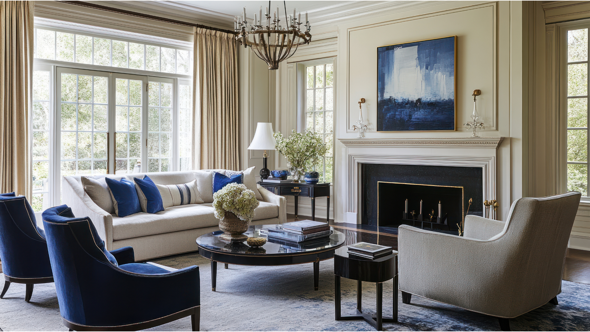
Imagine entering a front hallway painted in a dusky olive green—quiet, earthy, grounding. Then you step into a living room bathed in a soft gold or terracotta glow, which feels warm and conversational. Walk down a corridor shaded in blue-gray, and suddenly things slow down, the energy softens. Each room becomes a chapter in a story told not with words, but with color. It’s a kind of emotional choreography, and when done well, it’s not even something most people consciously notice. They just feel it.
The Power Of Placement
Designing for mood doesn’t stop at choosing the right color—it’s about putting it in the right place. One shade used across an entire home can feel flat, but applied strategically, it can evoke vastly different responses. A dark navy on an accent wall in a den feels cozy and enveloping. That same navy on all four walls of a kitchen might feel overly heavy, even stifling. Placement influences not only aesthetics but the psychological space each room creates.
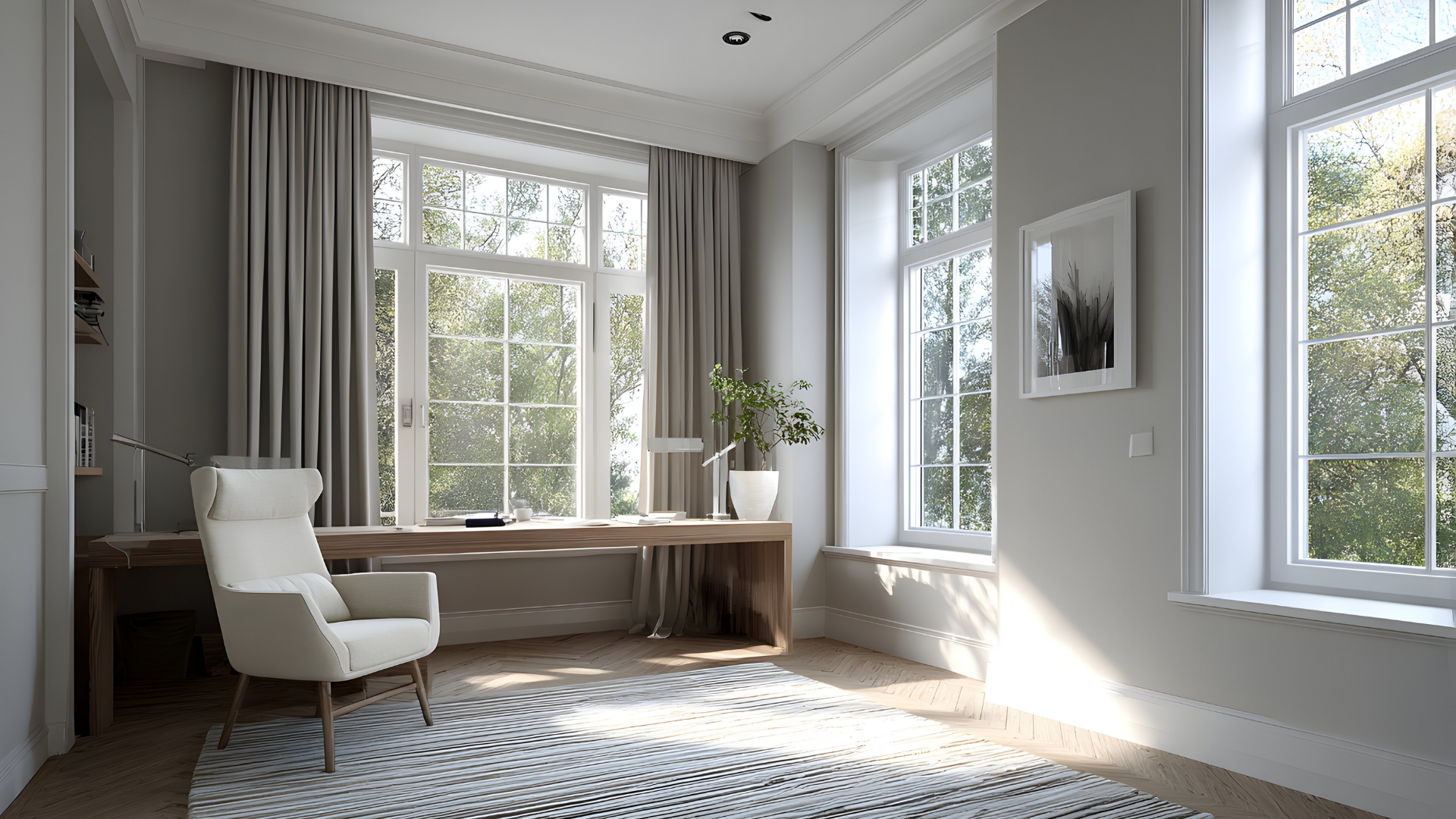
Ceilings, for instance, are an overlooked canvas. Painting them the same color as the walls in a smaller room can create a snug, cocoon-like feel. In larger, sunlit spaces, pale ceilings help lift the eye and expand the room's perceived height. Trim painted in a high-contrast color makes architectural details pop, adding energy and visual interest. But go tone-on-tone with a slightly darker base and lighter trim, and the room feels cohesive, serene, a little luxurious.
The magic lies in thinking of the home as a connected sequence rather than isolated rooms. Color transitions should carry intention. A soft neutral corridor between two bold-colored rooms can act as a palette cleanser, like a breath between musical notes. It gives your eyes—and your mind—a chance to reset.
Tone, Saturation, And The Nuance Of Feeling
We talk about color often in terms of names—blue, green, red—but the psychology of color is more nuanced than that. It’s not just about what the color is, but how intense it is and what undertones it carries. A pale robin’s egg blue doesn’t carry the same emotional weight as a deep teal. One might evoke open skies and optimism, while the other brings depth and contemplation.
Warm colors like reds, oranges, and yellows often energize and stimulate. They’re great for gathering spaces where you want conversation and movement—dining rooms, kitchens, even entryways. Cooler tones—blues, greens, grays—tend to calm and center, making them natural fits for bedrooms, bathrooms, and offices. But even that guideline depends heavily on the hue’s depth and saturation. A soft sage green might soothe, while a bold emerald might invigorate.
Then there are the neutrals, which many homeowners turn to for versatility. But beige isn’t just beige anymore. There are warm taupes with pink undertones, cool greiges with hints of blue, mushroomy browns, creamy ivories. Each one carries a mood, and the key is to pick a version that plays nicely with the emotion you want the room to give off. Even white isn’t immune to this—stark, gallery white feels crisp and modern, but can be cold in the wrong light. Meanwhile, a soft white with yellow undertones can feel welcoming and bright.
Lighting also plays a major role in how color behaves. Natural light brings out undertones, while artificial lighting can shift them. A room that glows buttery yellow in the morning might turn drab by evening if the lighting isn’t right. Testing paint swatches in different lights and times of day is an essential step in making sure your mood map hits the right emotional notes all the time.
Creating Flow And Identity
A well-designed home tells a story. Each space might have its own identity, but they shouldn’t feel like they belong to completely different houses. Mood mapping with color is about connecting those spaces through intention, while still letting each one serve its purpose.
Let’s say you start in a foyer that feels fresh and welcoming—perhaps painted in a light, dusty green. From there, you move into a kitchen that’s energized with soft amber or ochre, a color that warms under sunlight and encourages activity. The living room could shift to a more grounded tone—perhaps a smoky blue or mocha—creating a calm retreat after a busy day. A hallway might bring things down a notch, acting as a transitional space, before opening into bedrooms painted in soft lavenders or moody indigos. It’s a deliberate journey, and though you’re crossing into different emotional spaces, nothing feels jarring or disconnected.
The palette doesn’t need to be loud to be effective. Even subtle color variations can guide the mood—grays that edge toward lilac in one room and into slate in the next, or creams that lean golden in the afternoon sun but pale cool in the morning light. It’s these shifts that create a home that feels layered, considered, lived-in.
The point of mood mapping isn’t just visual appeal—it’s creating an experience. The right colors can ease you into your morning, give you energy to work, help you unwind at night. They can make guests feel welcome, kids feel cozy, and spaces feel truly personal.
Let’s Design The Mood You Want To Live In
Interior paint is more than color on a wall. It’s atmosphere, it’s emotion, it’s the backdrop to your life. When chosen and placed thoughtfully, it becomes a tool for shaping how you feel in your home—room by room, moment by moment. Whether you’re looking to energize, relax, inspire, or reset, the right hues in the right places can make a powerful difference.
At Brite Coat Painting, we take pride in helping people turn their houses into spaces that support and elevate their everyday lives. If you’re ready to explore how your home can feel more aligned with who you are and how you want to live, we’d love to talk color.
Contact us today and let’s build your personal mood map, one brushstroke at a time.